
Dubai Storage - Brand & Dashboard
Brand refinement, a UI kit and dashboard design for a storage platform.
About the project
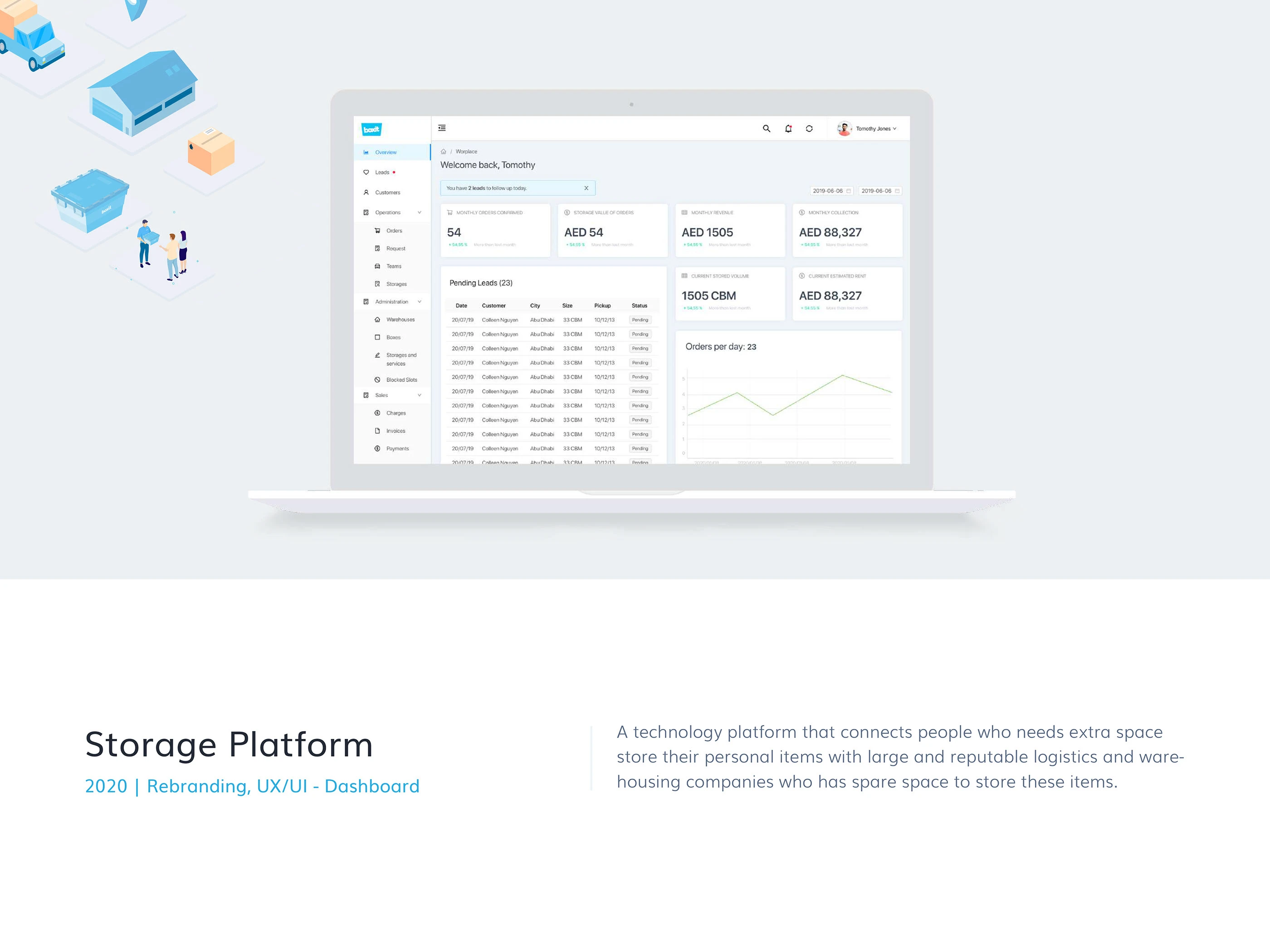
The platform connects people who need storage space with logistics and warehousing companies. The case covers refinement of the Boxit brand, visual guidelines, illustration and an operational dashboard.
Overview
I refined the existing visual identity and developed a shared language for the dashboard, illustrations and interface assets.
The Challenge
The challenge was to make an existing brand cleaner and more legible at small sizes while supporting a data-dense interface for storage operations.
Process & Design Decisions
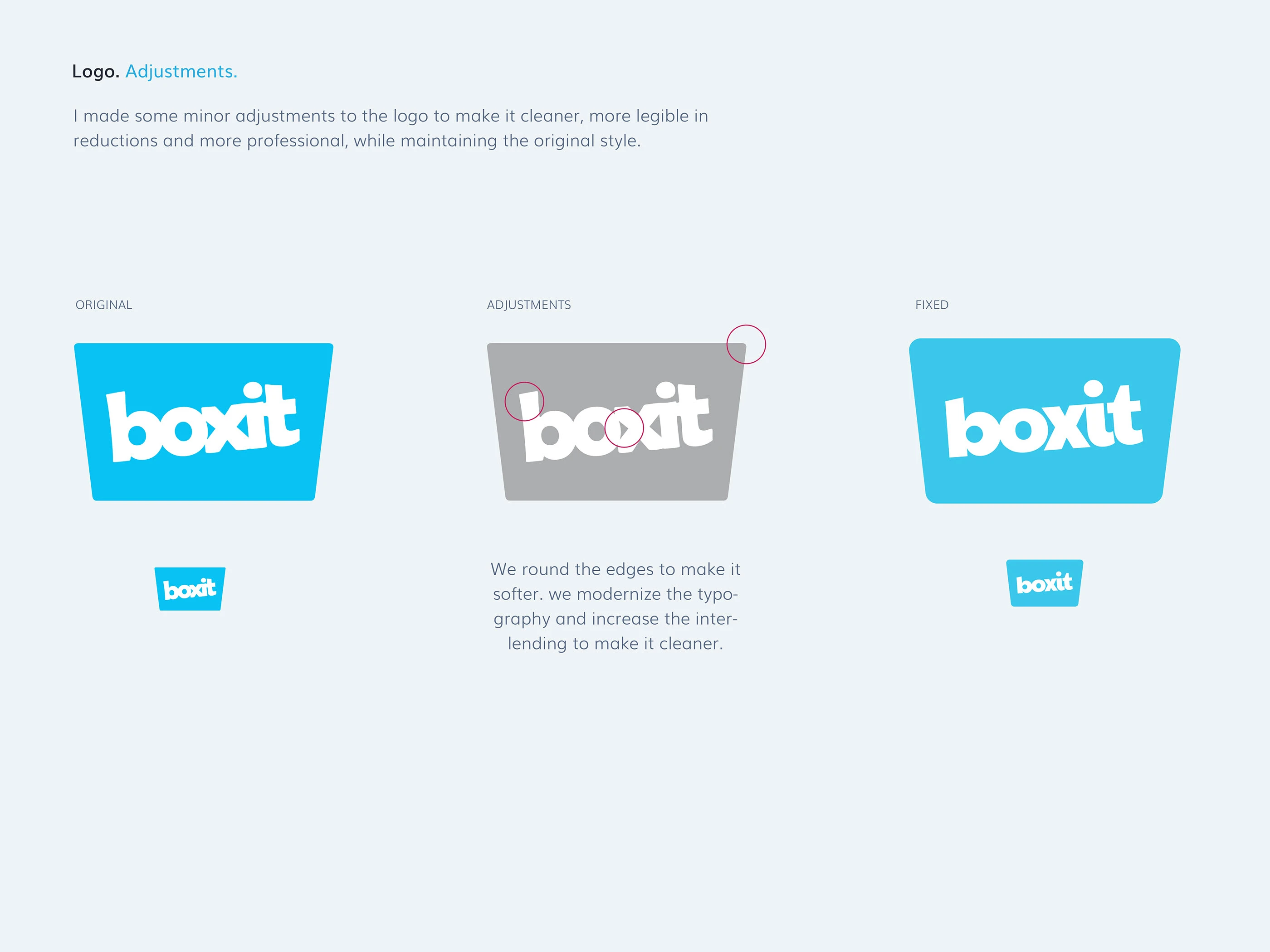
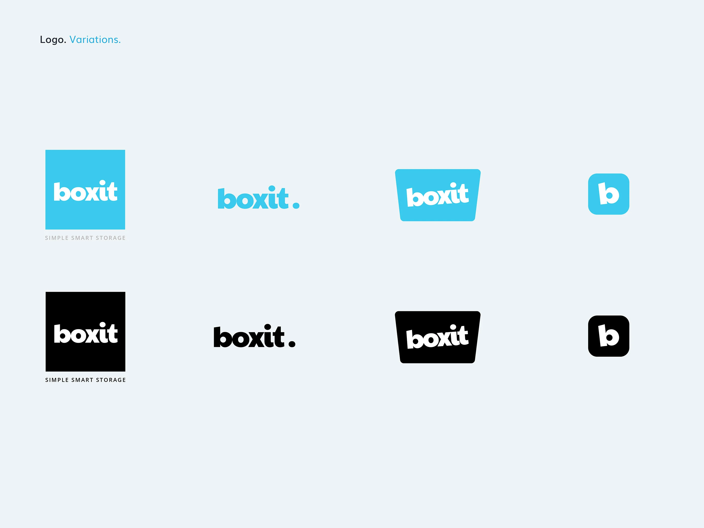
The logo adjustments softened edges, refined the typography and increased spacing between letters while preserving the original character. Variations cover compact and monochrome applications.
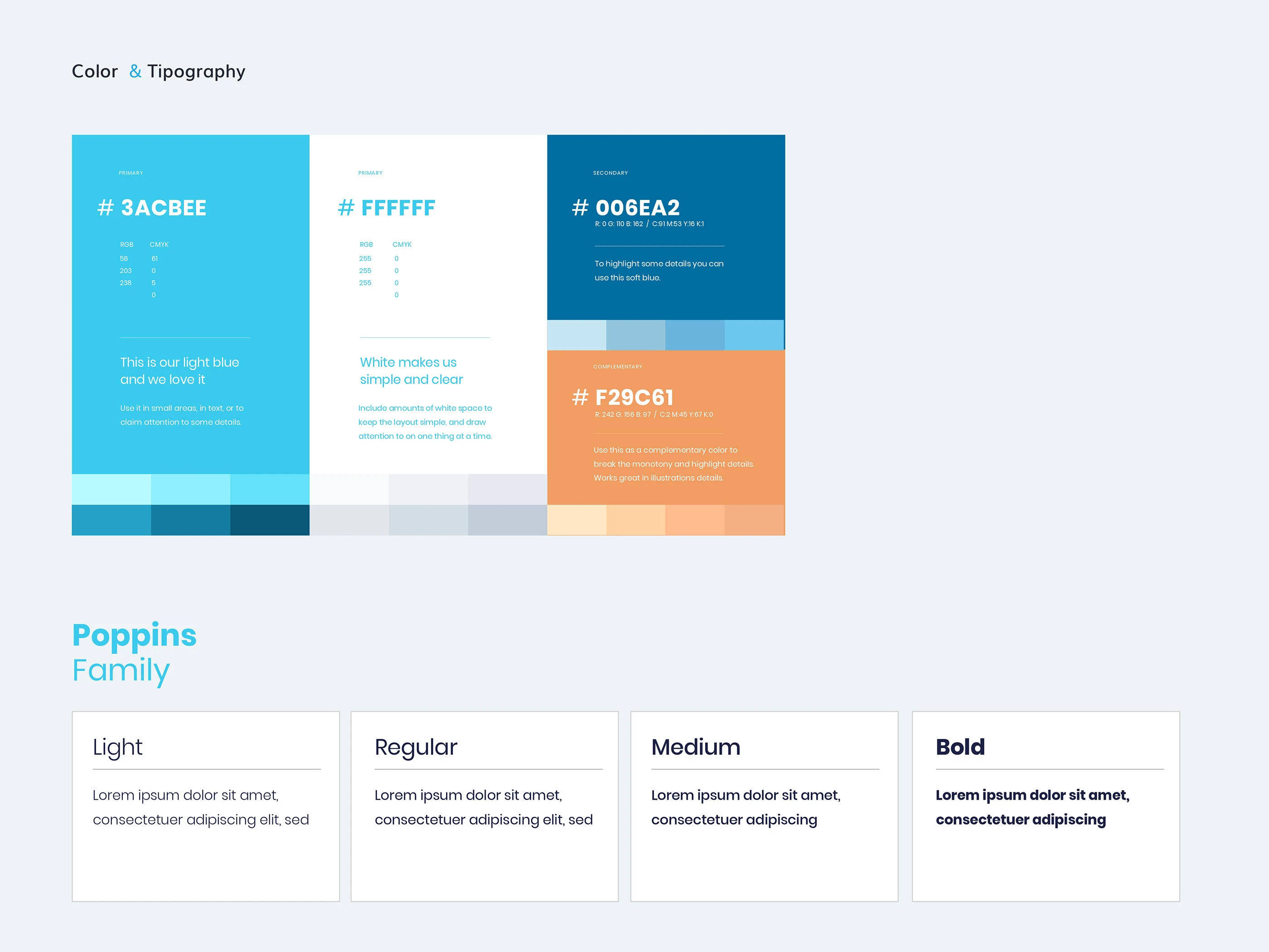
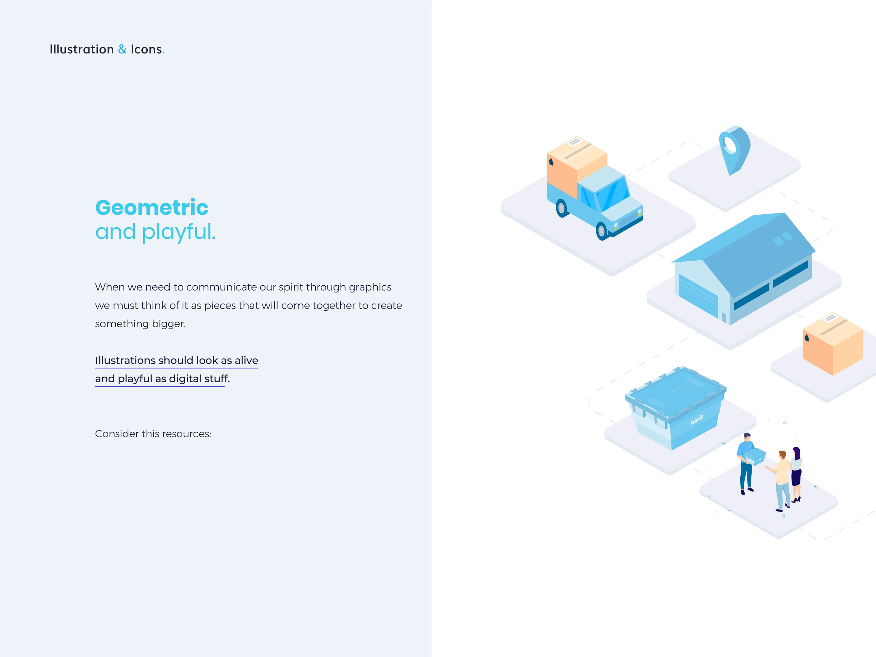
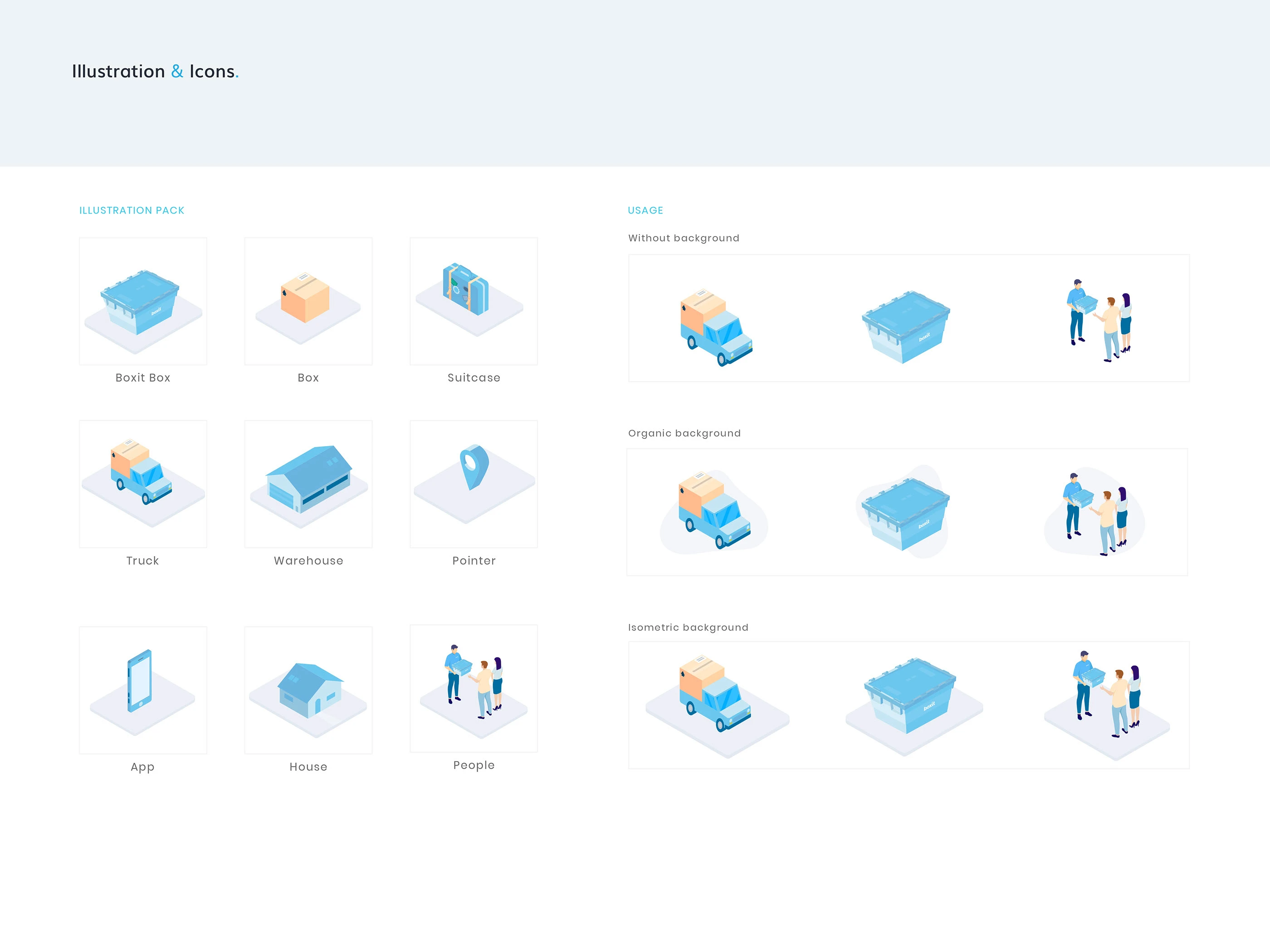
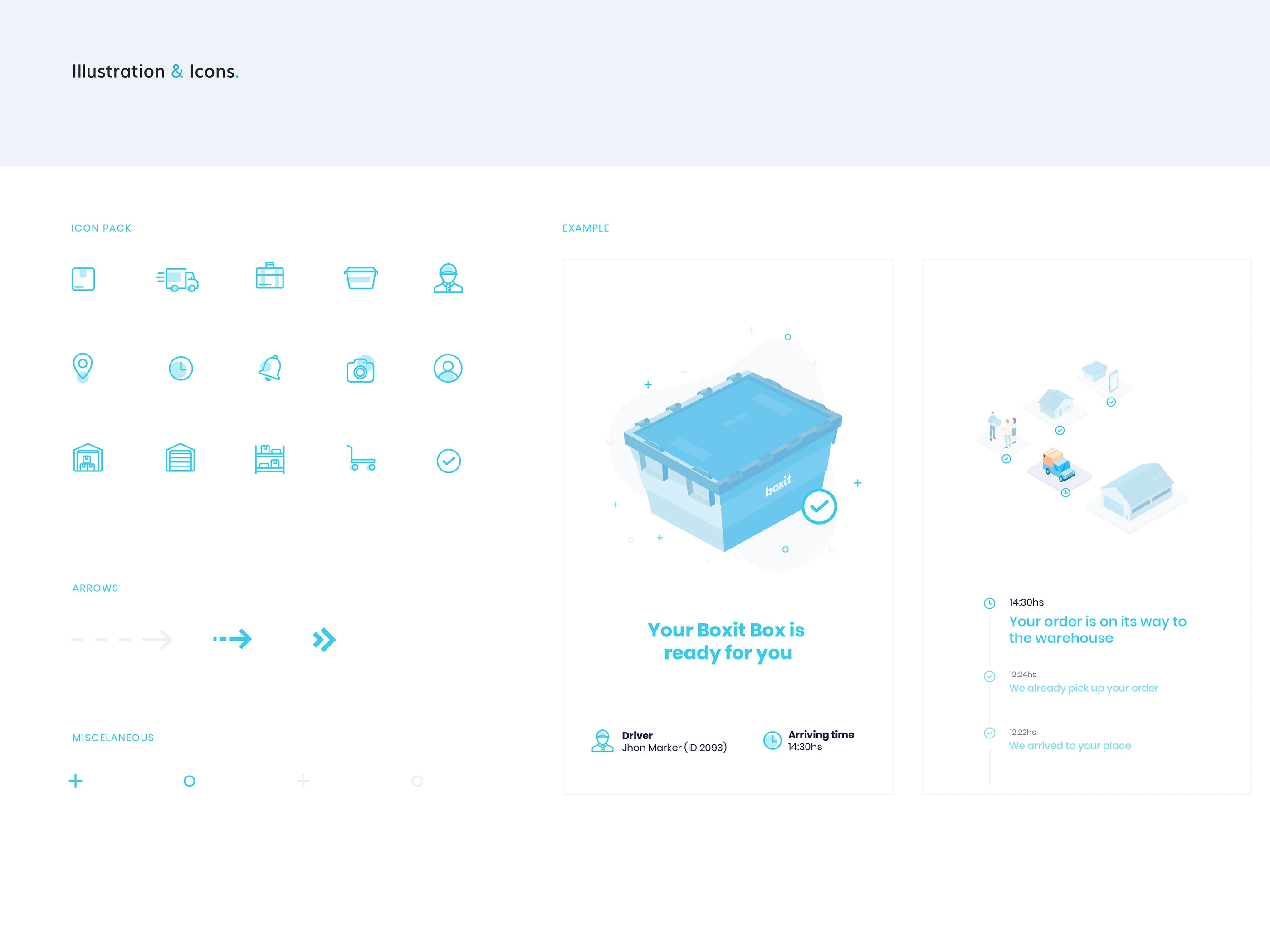
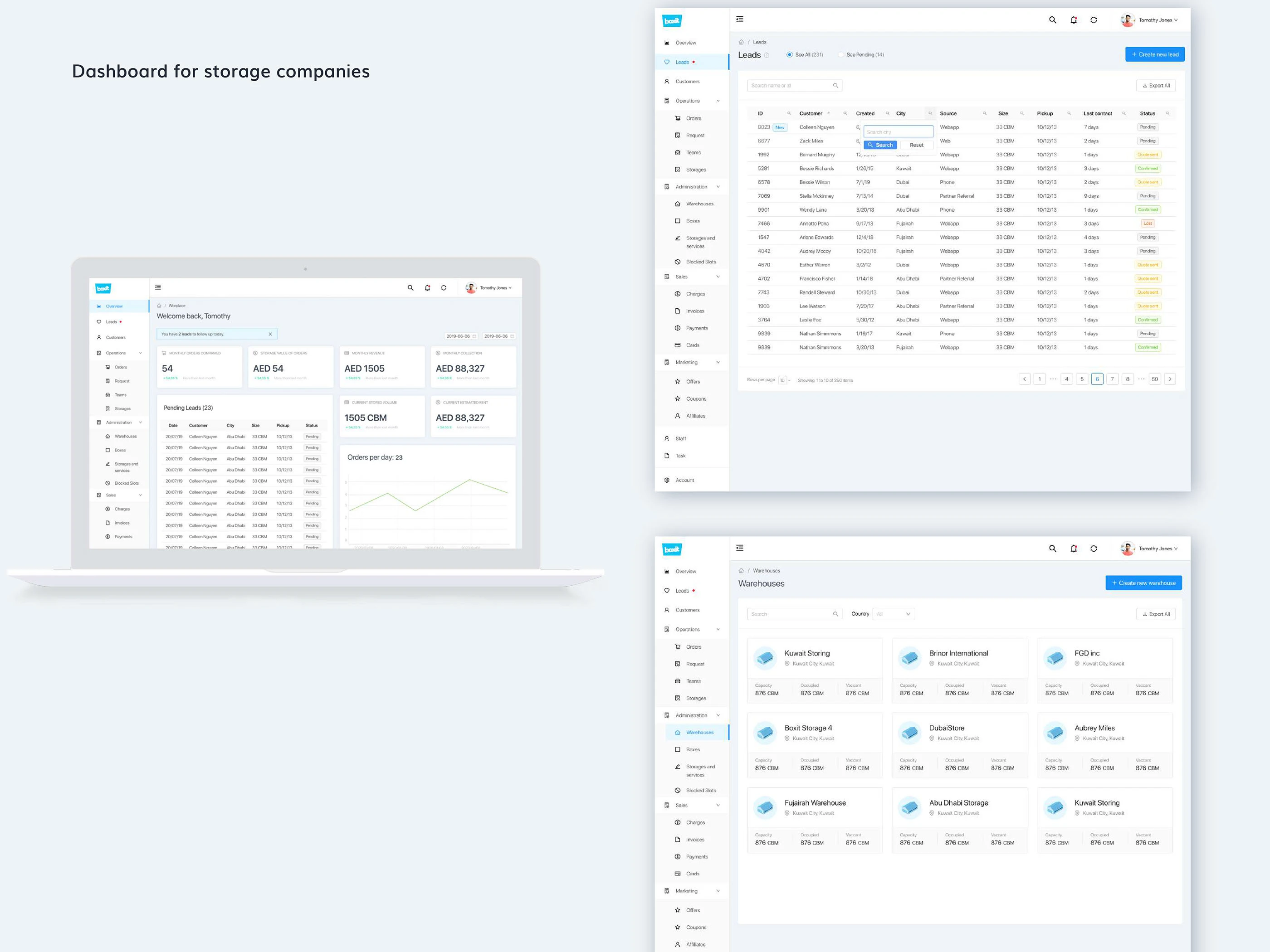
The visual foundations combine a cyan-led palette, Poppins typography, geometric illustrations and an icon family. The dashboard organizes operational information through navigation, summary cards, tables and status indicators for leads, customers, orders and storage.
Results & Learnings
The work brings the refined logo, visual guidelines, illustrations and dashboard screens into a consistent system. It illustrates how brand expression and functional information design can support each other in an operational product.